Bigger is better. This philosophy has been at the core of the ever growing list of full screen websites that have been spawning all over the web in recent times.
With ever increasing speeds and development technologies improving faster than the speed of light, ‘full screen website’ is the current hot web design trend.
Introduction
A full screen website is a website that encompasses the complete display estate of your device and fills the entire browser window with its content.
Such website is generally better looking and more interactive than a conventional website.
The principal aim of a full screen website is to ‘immerse’ the user into the content with additional disturbances carefully masked by the website’s layout and effects.
Full Screen & Infinite Scrolling
One common feature of the full screen websites is infinite scrolling.
Infinite scrolling is a design method where the content of the website gets updated as the user scrolls through the website. This feature enables the developers to present the content of the website in a serial story-telling format. This achieves the goal of keeping the visitor hooked onto the website while being informed about the brand.
Full screen websites, with their beautiful layouts and seemingly unlimited design possibilities are being looked upon as the future of website development by web designers. But like every coin has two sides, even full screen websites are not without their shortcomings.
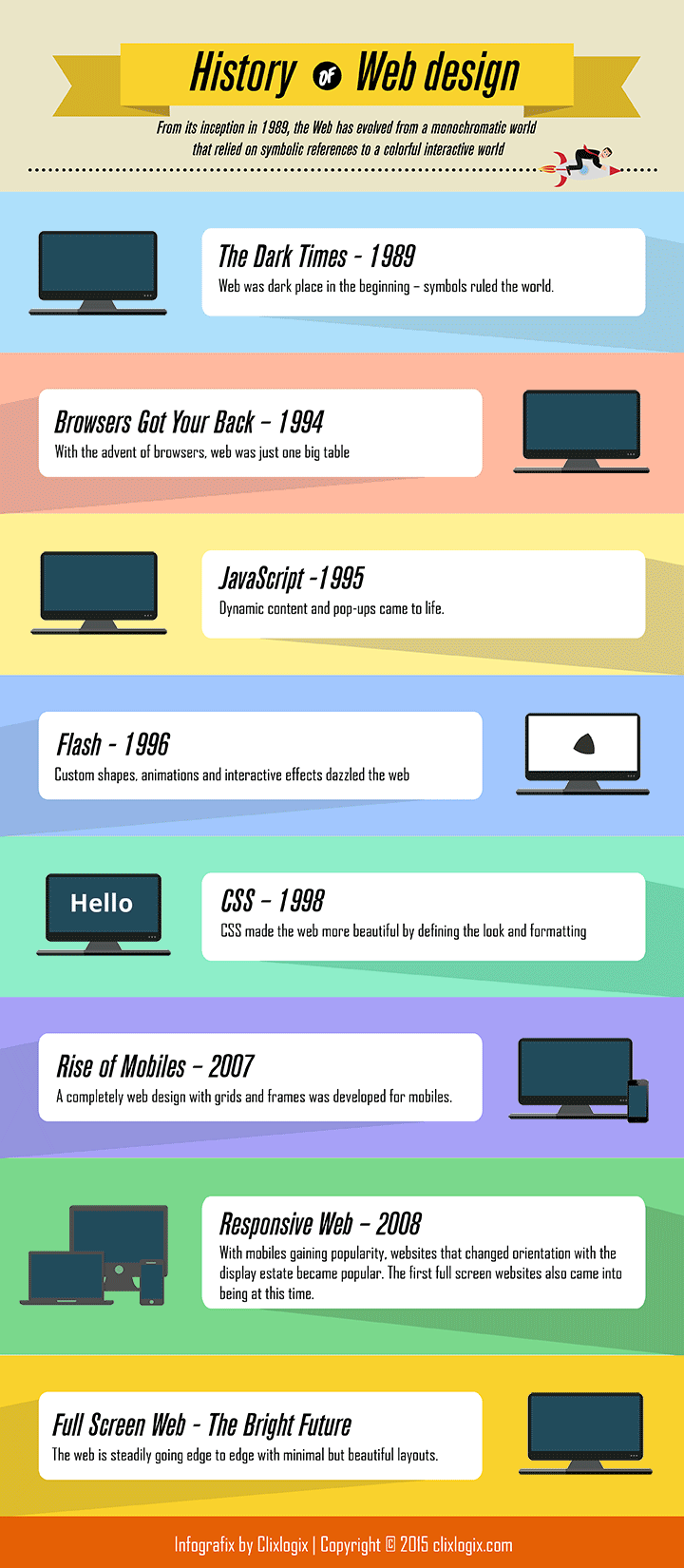
Origin Of Web Design
From its inception in 1989, the Web has evolved from a monochromatic world that relied on symbolic references to a colorful interactive world. Every decade or so a new web design trend swoops in and changes the landscape of the realm we call the Web.
Full Screen Websites are being hailed as the next big step in the journey of making the web a lot more beautiful, interactive and user friendly. They first appeared on the web in the first decade of the 21st century and since then they have been slowly but steadily populating the web-verse.
Initially full screen layout didn’t find much appreciation in the designer circles who touted the layout as ‘too gimmicky’ and ‘not worth the effort’.
But a slight change in the philosophy and a lot more willingness in developers has put the full screen websites back in resurgence.
Application Of Full Screen Websites
Over the past few years, electronic screens – be it desktops, laptops or smartphones – have gone towards the larger end of the spectrum. Today a screen larger than 1024 pixels is the rule rather than an exception.
So it is only natural that the Web also ‘expands’ in size.
When the developers noticed that maximizing the browser window created an unnatural looking white space outside the website, a stronger than ever need was felt for a newer web design. That’s when the ‘fuller’ web came into existence.
What Does Your Brain See When You See A Full Screen Website?
A well designed full screen website can ‘immerse’ the viewer in its content, enabling the user to focus only on what you want the user to see.
As we have evolved from a hunter-gatherer species, our peripheral vision continuously feeds our brain with a steady stream of information that is in our field of view even though we are not directly looking at it which means that while looking at a website at 920 px, we get distracted from sidebars, menus, advertisements etc.
But when you are immersed in a full screen website, for your brain it means that there are no distracting sidebar, no flickering banners – nothing that might distract you from the content.
Breaking content into separate blocks allows users to quickly and efficiently process information on content-heavy pages. Proper usage of color tone and background images can keep the user hooked to a website.
Playing a soothing music in the background or using moving images can make your website irresistible to your audience.
Below are some full screen websites that play with your senses in a great way.
1. WhiteBoard Inc.
WhiteBoard is creative agency located in Tennessee, USA. Their website is a great example of a full screen website with a minimalistic white background and precise textual content.

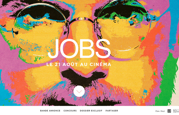
2. Job Is Free
This website was created as a companion to the 2014 movie ‘Jobs’ about Steve Jobs, the legendary CEO of Apple. It features snippets from the movie along with a powerful cover image of Steve Jobs himself with the added feature of infinite scrolling. This is a perfect example of how moving images add to the charm of a website.
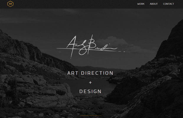
3. Andy Burdin
Andy Burdin is a well-known interactive designer and he has showcased his abilities perfectly on his personal website using a full screen layout. The website is largely in gray-scale thus shifting the focus on the function rather than the form – just how full screen web design intended the web to be.
Full Screen Web Design – The “Oh Yeahhs!!”
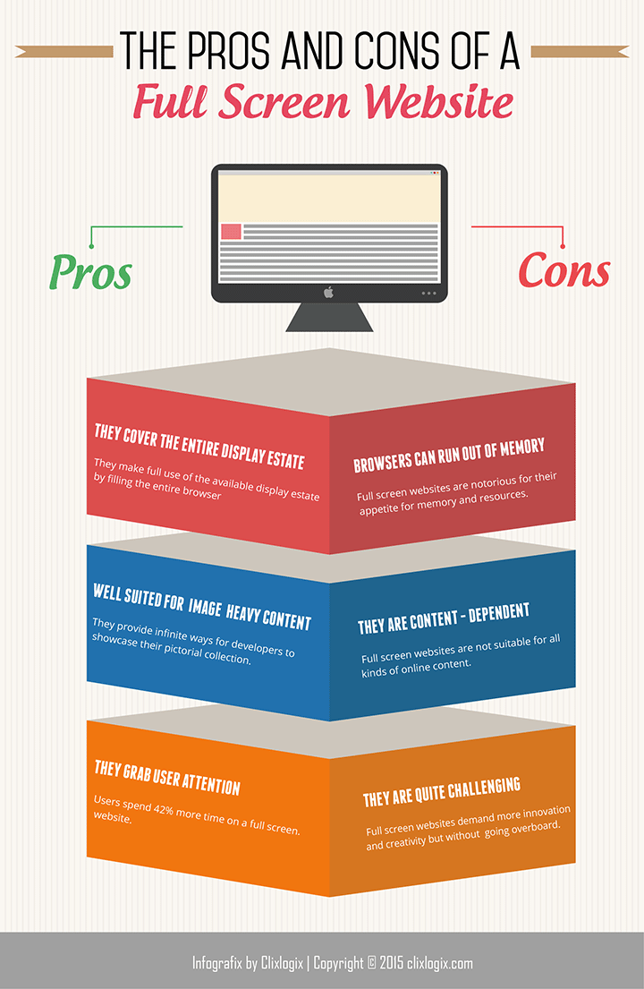
- Full screen websites are the Irish drinkers of the web – they consume it all. Such websites make full use of the available display estate by filling the entire browser window while carefully removing distracting menus.
- A full screen website generally means a website with infinite scrolling at its design core. This makes it very familiar for smartphone users.
- Full Screen websites were born to bring image heavy content to the forefront of the viewer’s visual range. They provide infinite ways for developers to showcase their pictorial collection.
- A full screen website with intuitive graphics piques the curiosity of an average user.
“The Oh Nos!!” of Full Screen Web Design
- Due to their affinity for design heavy layout and content, full screen websites are notorious for their appetite for memory and resources.
- Full screen websites, though aesthetically pleasing, are not suitable for all kinds of content. Only those websites which require the reader to go through the content in a serialized manner are better suited to full screen design.
- Full screen websites also demand more from the developers in terms of innovation and creativity as well as tasking them with making sure that they don’t go overboard.
- Some browsers don’t take too well to full screen websites and often load the website imprecisely.
How Do The Developers Make You Go Wow!
If websites were desserts, a full screen website would be a crème brulee – simplistic in appearance but pretty intricate in preparation. Designing an almost perfect website requires a precise use of HTML, CSS and certain HTML Frameworks.
Bootstrap In Full Screen Web Design
Bootstrap HTML framework provides a set of stylesheets that provide basic style definitions for all key HTML components. These provide a uniform, modern appearance for formatting text, tables and form elements to use in a full screen website. Bootstrap CSS lends the fluid layout to a full screen website. It divides the column width to streamline the appearance on a full screen website that gives it the much loved uniformity.
Foundation In Full Screen Web Design
Foundation HTML is responsible for making a full screen website responsive – the website layout changes according to the display estate. It shrinks the website when you are on a mobile device and expands it when you are on a large desktop screen.
To sum it all up, larger display screens have been continuously pushing the web design trends over the years and Full Screen Web is the next logical step. Currently, 11% of all websites have a full screen layout and users spend 42% more time on full screen websites.
The number of full screen websites is only going to rise. They are beautiful to look at, a pure joy to navigate and have a high UI/UX potency.
A website in all its full screen glory is a sight to behold but it can also quickly turn into a hideous monster if applied to an inappropriate idea, leaving your audience pulling their hair off. So go full screen but with some caution.
And watch your website become the beauty that it was always supposed to be.
A good full screen website is a treat to the senses. If you want an amazing full screen website then contact us and allow us to unravel the beauty of your brand on the web.
 DM Us
DM Us


